11:12 P.M. cst
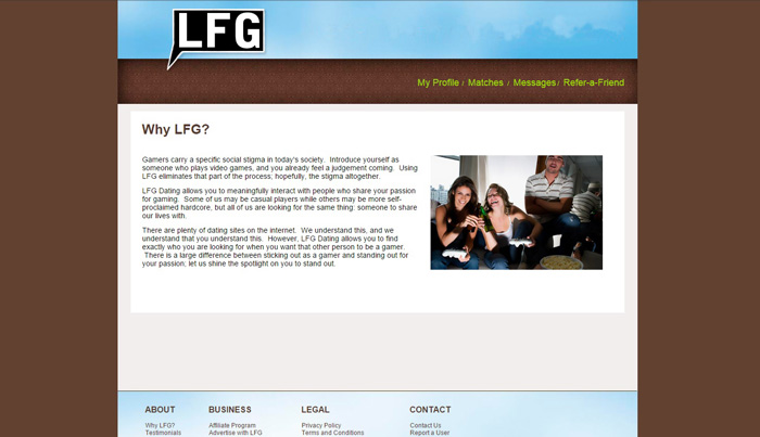
With our Houston Live Blogging event in full swing, and since #TBT technically still is on like Donkey Kong for another hour or so in Texas, we thought what a better time to humbly showcase our original LFGdating site design. So sit back, light a candle, and soak that sleek 2012 design in.
You’re impressed, aren’t you? Who wouldn’t be? I mean come on, let’s be real: there’s not a more romantic color combination in the world than sky blue and dirty brown. Am I right or am I right? All kidding aside, this was really before the push for responsive web design (which LFG is rocking now) became mainstream, but I think we can all agree it is pretty hilarious to look back on today.
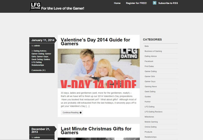
Our mega-popular Gamer Dating Blog also is now sporting a spiffy fully-responsive, HTML 5 site design, but back in 2014 that wasn’t the case as you can see below. While this definitely got the job done for our users, and was a marked improvement from the 2012-era, it is still hilarious to look back on today.
I would show you more #TBT facepalm-worthy goodness, but I don’t want to scare ya off. Lots more to come during this weekend’s Houston Live Blogging event, so stay tuned, and thanks for stopping by LFGdating!


Leave a Reply
You must be logged in to post a comment.